Why Great Interfaces Live in the Corners of Your Vision
Discover how peripheral vision shapes user behavior and why many modern UX principles are rooted in cognitive mechanisms developed over hundreds of thousands of years of human evolution.
Ever wonder why are notification badges, toast alerts, and chat heads almost always banished to the corners of our screens? Is it a clever rule invented by modern UX designers to keep our interfaces clean? Not really. The real reason is actually hardwired into our DNA.

Hundreds of thousands of years ago, during the hunting and gathering period of human history, men as the solitary hunters and women as the camp-bound gatherers. All while living on the knife's edge of a thousand surrounding perils.
Imagine an early ancestor crouched in the tall grass of a sprawling, golden savannah. And they are entirely focused on a complex task - craft a sharp hunting tool (for example). While focusing in on the flint, calculating angles and force.
Suddenly,
a few yards away, the grass rustles. A subtle blur of golden fur shifts in the corner of their eyes.
Instantly,
the tool-making stops. Adrenaline spikes. They look up—a saber-toothed tiger is pacing toward them...
Did they escape? Perhaps, but that is not the main point here. What matters is where their attention was anchored - they were completely focused on the hunting tool. "That subtle blur" wasn't detected by their direct line of sight, it was caught by - what we today call Peripheral Vision.
During the hunter-gatherer era, Central Vision was for focus and task completion, but Peripheral Vision was the body’s early warning system. It was the radar that kept humanity alive.
Fast forward to today. We are no longer scanning the horizon for predators, but our biology hasn’t changed. Instead of the savannah, we are navigating a digital wilderness of landing pages, software dashboards, and mobile apps.
Human Vision - How We "See" Digital Interface
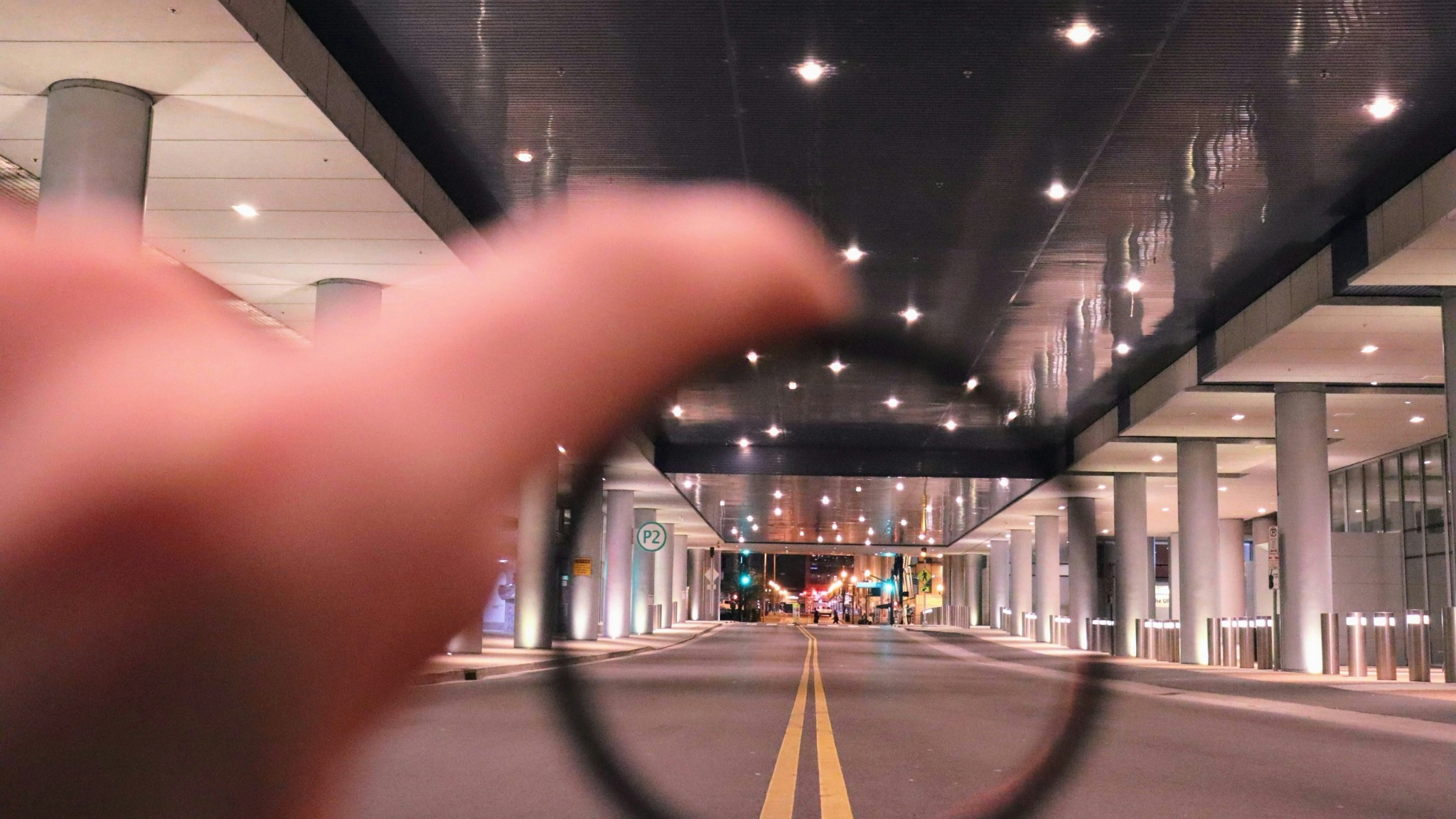
We tend to think of human vision like a high-definition camera, capturing everything in equal detail. In reality, our Central Vision—the fovea—only accounts for a tiny slice (1-2%) of what we see. It’s highly detailed, but incredibly narrow. Everything else is Peripheral Vision (98-99%).
Rayner, K. (1998). "Eye movements in reading and information processing: 20 years of research." Psychological Bulletin. Read More

Behavioral science reveals a fascinating truth about how we process digital interfaces: we don't read screens - we feel them out. When a user first lands on your website, their central vision might land on your headline. But simultaneously, their peripheral vision is rapidly scanning the edges of the screen to gather the "gist" of the environment. In a fraction of a second, the periphery tells the brain what kind of site this is, where the navigation lives, and whether the environment feels chaotic or safe.
Jakob Nielsen (1997). "How Users Read on the Web." Nielsen Norman Group. Read More
If the peripheral layout doesn't match the user's mental model of what your site should be, they will feel disoriented before they even finish reading your first sentence.
Guiding the Eye’s Next Jump
When we look at a screen, our eyes do not glide smoothly across the layout. Instead, they move in a series of rapid, jerky jumps, pausing briefly at certain spots to take in information.
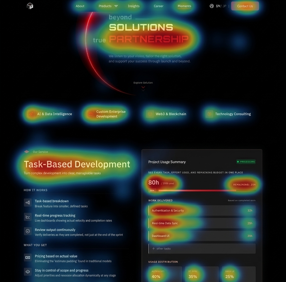
The fascinating secret of human biology is that central vision is completely blind to where it should jump next. It relies entirely on peripheral vision to act as its scout. While your central vision is busy reading a specific word or looking at an image, your peripheral vision is actively surveying the surrounding landscape. It recognizes shapes, structural patterns, and lines, and whispers to the brain: "Hey, there is a prominent heading down there," or "There’s a button-like shape to the right, let's jump there next."
This means peripheral vision dictates the entire journey a user takes through your interface. If a layout lacks clear structural patterns—or if key elements are buried in places the peripheral scout doesn't recognize as important—the user's eyes will wander aimlessly. To design seamless user flows, we must place visual anchors where the peripheral scout expects to find them, creating an intuitive path for the central vision to follow.
Wired for Motion - The Periphery’s Threat-Detection System
Because our peripheral vision evolved to detect threats, it is hyper-sensitive to motion and high-contrast changes.
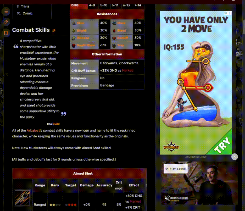
If you've ever tried to read an insightful article while an animated banner ad flashing on the side of the page, you know how physically exhausting it is. You are fighting your own DNA. Your central vision is trying to focus on the text, but your peripheral vision is screaming, "Look over there! Something is moving! It might be a lion!" This tug-of-war causes cognitive fatigue.
When designing interfaces, we have to remember that anything moving or blinking in the periphery is not just a visual element, it is a neurological distraction. If the goal of a page is deep focus—like reading a complex report, filling out a multi-step form, or completing a checkout—you must relentlessly strip away peripheral distractions. Silence the alarms so the user can focus on the "flint".
How Do We Work for The Modern Savannah?
Embrace Negative Space as a Buffer
White space (or negative space) is not empty real estate waiting to be filled. It is a visual buffer. Generous white space around your central content calms the peripheral vision, telling the brain, "There are no threats here. You can focus."

Use Motion Sparingly and Strategically
Reserve animations, pop-ups, and flashing elements for moments when you absolutely must rip the user's attention away from their current task (e.g., a critical system error or a successful transaction completion). If everything moves, nothing is important.
Design for the "Squint Test"
Lean back from your monitor and squint at your design until the text becomes illegible and the shapes blur. This roughly simulates what the peripheral vision processes. Does the visual hierarchy still make sense? Does the layout provide the peripheral scout with a clear map of where to send the central vision next?
Final Thoughts
Our tools have evolved from stones to supercomputers, but the humans using them remain fundamentally the same. By respecting the ancient, hardwired mechanics of human vision, we can design interfaces that don't just look beautiful, but feel instinctively right. When we design for the periphery, we stop fighting human nature—and start designing for it.